Showing posts with label Brand Recognition. Show all posts

Wednesday, 28 August 2013

Lucy's view: Ben Affleck as Batman? Just think of it as a rebrand

Batman Superman logo 2015
The logo for the Batman and Superman
film to be released in 2015.
There seems to be a lot of negativity around the decision to cast Ben Affleck as the new Batman, and I can see people's concerns. But let's face it, this is not the first time this has happened and it will not be the last, I am sure people remember the media hype around Daniel Craig being cast as James Bond, and look how that turned out. For the record, I am aware James Bond is not a superhero, but his character is treated in a very similar way. Everyone has a favourite 'Bond' just like everyone has a favourite Superman, Spiderman, and obviously Batman, and I think it's pretty obvious that every actor brings something different to the role.

We oppose change

We humans are creatures of habit, and tend to resist change, and this is true across every aspect of our lives. And shaking up the casting of our favourite superheroes is always going to cause a stir. But superheroes are not the people in the suits, they are the characters with compelling stories, from comics dating back to the 30's (DC was founded in 1934, Marvel in 1939). Having a brother who is majorly into his comic books, I am learning that there are so many different story lines and variations in characters, that there is no way that the films can even keep up!

Also, these superheroes do not seem to age much. Kirk Alyn was the first actor to play Superman, way back in the 40s, there is no way he could still be playing the role now! And I am sure there was some upset when he was replaced, just like what's going on with Batman now.

Another factor to consider is that different comic book writers have brought their own spin to the characters, take the Tobey Maguire "Spiderman", and Andrew Garfield "The Amazing Spiderman", both actors are portraying a different Spiderman, created by two different sets of writers. Both required different actors, as both are essentially different characters, just they have the same name. It's a lot more complicated than it seems on the surface, which is why I trust the people casting for these roles, they know what they are doing! Ultimately, times change, roles and actors change, and thus people are replaced.

Tobey Maguire Andrew Garfield Spiderman
Tobey Maguire as Spiderman (left). Andrew Garfield as "The Amazing Spiderman" (right).
You can tell the character / icon is still Spiderman, effectively the character has just been rebranded.

"It's simple we kill [rebrand], the Batman" - The Joker

Whilst thinking about the news of Ben Affleck's casting, I couldn't help but notice the similarities between this situation and rebranding, as essentially, that is what's happening. Batman is still Batman, there is just a different guy behind the mask. He still has the same name, he just looks and acts a bit different, within the constraints of the character. Sound like a rebrand to you?

Batman is technically a brand, his suit and logo are icons of his brand, and it is a brand's icons that stick with you as a consumer. But, as Interbrand so succinctly put it:

"Icons are tremendous assets with incredible value, however they require regular updating to infuse them with new and relevant meaning."

As much as we like things to stay the same, we sometimes have to admit to ourselves that things have got a bit tired, or, if we're savvy, we may decide to freshen things up whilst we're still onto a good thing. And this is when we decide to rebrand. It's probably a good job Christian Bale got out now, soon we'd be complaining things had become too 'samey'. At some point, you, or in Batman's case Warner Bros., have to take a leap and change things, and wait for both the positive, confused, and negative reactions. Nobody is ever going to please everybody!

We feel strongly towards our favourite characters because we have empathy with them. When a different comic book writer writes about a well known character, or a new actor is cast for our favourite superhero, they are going to bring their interpretation to the table, it is still the same character, but just slightly different. Superficially our feelings may change towards the character, maybe because we don't like the new writer or actor as much, but remember, it's the writer or actor you're not keen on, not the character itself. The same rules apply to rebranding, people may initially not warm to a new look, but it's what's underneath that retain customers and keeps people interested. Like a brand, the suit and, the character's name, are just the first of many layers that people experience when interacting with a brand.

Change is good, but remember your story

itv rebrand
The itv rebrand caused quite a stir when it was launched, now it is
accepted as "the norm".
In a rebrand, you may change your logo, colour palette and strap lines, you may even change your name! But underneath you are the same company, probably with the same mission and values. You are essentially the same, you just look a bit different, you may even act a bit differently. During a rebrand you might strengthen your policies, tighten your internal operations, and become bigger, bolder, and better. One of the most important things to remember in business is that your brand will mean different things to different people. Individuals will interpret your brand in different ways, and this is how a unique business to customer relationship is formed. If you change things peoples feelings may change, but you are likely to attract more people to your business if you are brave, change things, and throw yourself out there. What makes you shine more than any of this is your story, both as a company, and as an individual, this is your continuity, what carries through your old and new brands, this is what people buy into.

As previously mentioned, the decision to cast Ben Affleck has caused controversy, but the experts have selected him for the role, and I am sure they have considered Batman's characteristics when making this decision. In the same vane, when undertaking a rebrand, it is important to consult experts. You know your brand better than anyone, but it's the expert that will help you to unearth the true potential of your brand. An expert will help you to reinvent, reinvigorate and rejuvenate, whilst making sure that there is a clear continuity between old and new. 

Let's not write Ben off just yet, let's embrace change and give it some time to become the norm, then we can start complaining all over again when Warner Bros. decide it's time for another recast, sorry, rebrand!

We'd love to hear your opinions, tweet us @ubd_studio

Wednesday, 17 July 2013

Owen's View: 'Branding' yourself- tattoos

Examples of sugar skulls
Since my college days I have been thinking about getting a tattoo, but haven't yet made the commitment to a design that I am prepared to wear on my body for the rest of my life. Our recent work with Treboom Brewery, and our research into sugar skulls got me once again thinking about tattoos, but also branding, and how the two are alike in so many ways. 

Tattoos symbolise being part of tradition, part of a group or clan, or to stand out and even shock. In the same vein, the reason businesses and individuals 'brand' is to differentiate themselves from the next person or business.

Recently the worlds of branding and tattoos have mixed quite dramatically, with huge brands including Reebok, Red Bull, HBO, ASOS and Sailor Jerrys offering free tattoos at various film and music events. The number of willing participants just proves how dedicated some brand fans can be, and that tattoos are no longer a symbol of rebellion.

And what about being dedicated to your company? I have thought about having the United by Design logo tattooed on my body, but this is my business, it's a part of me and something I feel strongly about. But I am not so sure about what's going on over in New York at Rapid Realty, the company is offering a 15% rise in commission to every member of staff who has the company's logo tattooed on them. Over 40 staff have been inked so far!

Tattooing is highly profiled in the media. The rise in popularity of shows such as Miami Ink is inspiring more people than ever to go out and get inked. The amount of celebrities now sporting tattoos makes the once frowned upon art-form even more part of the norm. After the 2012 Olympics, several of the GB athletes, including the majority of the women's basketball team, went and had tattoos incorporating the 5 Olympic rings, highlighting their dedication and pride to sport, Great Britain and the Olympic games.

Azania Stewart- member of GB women's basketball team with tattoo
Azania Stewart- Member of GB Women's Basketball team with her tattoo.

On the other hand, there is still a certain amount of prejudice when it comes to those with tattoos. Air New Zealand have been forced to rethink their policies after being slated for turning away a prospective employee due to her moko, (Maori), tattoo on her forearm. It is reasonable to say that some tattoos are offensive or inappropriate, but taking in pride in your heritage is no bad thing!

In Japan, tattoos still shock and unnerve people, as the showing of body art by Yakuza gang members is considered a sign of aggression. Attitudes are warming slightly to the tradition, as more and more people have started experimenting with irezumi (japanese style of tattooing).

As for my tattoo, I am inspired by japanese, polynesian and moko styles, in fact I have a Pinterest board dedicated to the tattoos that inspire me, check it out here. While I continue to make my mind up I may experiment with some temporary tattoos, such as these by Lydia Leith.

And just like tattoos, branding is something that has to be thought about and considered carefully. There should be a meaning behind your choice and why you are going ahead with such an investment. With regards to both tattoos and branding, seeking advice from an expert, and doing your research, are paramount. It may cost you, but you want the job to be done properly- money definitely well spent if you're going to have the branding, or the tattoo, for a VERY long time!

Are you inked? Tweet us some inspiration @ubd_studio


Sources of information: 
http://www.today.com/money/company-ink-agents-get-15-raise-corporate-tattoos-6C9714898 
http://www.details.com/blogs/daily-details/2013/05/the-tattoo-as-corporate-branding-tool.html 
http://www.stuff.co.nz/taranaki-daily-news/opinion/8739378/Editorial-Air-NZ-makes-a-moko-mistake
http://www.dontpaniconline.com/magazine/radar/horiyoshi-iii-inks-japan

Wednesday, 12 June 2013

Annabel's View: European Confectionery Brands- My Sugary Inspiration

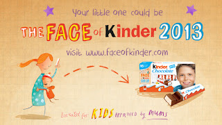
Face of Kinder Campaign
The 'Face of Kinder' campaign.
Recently, Kinder launched the new campaign, 'The new face of Kinder' and I've seen it everywhere. The ads use naive and whimsical pencil-drawn-style illustrations and type. It's a great way to get kids and parents actively involved in the brand.

Having had a couple of holidays in Germany, I know how important their confectionery is to them, how the aisles and aisles of chocolate and gummy bears running down the Galeria Kaufhof food hall (large German department store) are much-loved by residents and visitors too.

For inspiration for children's brands and confectionery brands, I often think to those long aisles of colourful packaging and soft sweet scents, and the light-hearted adverts that make us smile.

Haribo and Maoam

One of the most popular German brands is Haribo. I bet we all know their strapline by now. To get some childlike inspiration and a smile on your face, watch the Haribo and Maoam (sub-brand) ads here:


Maoam ads: www.maoam.de/lang/enGB/index.html

Ferrero and Kinder

And for more inspiration watch the Ferrero and Kinder ads here: www.ferrero.co.uk/?IDpagina=1776

To see the New Face of Kinder campaign, with its lovely typography and illustration style, and to enter your little'un: www.faceofkinder.com

Ferrero is currently running two competitions: to design and win your own bike helmet, and to win a family cycling holiday at Centreparks, with its other sub-brand Nutella. The brand is very much about family involvement, which is smart; it's the parents who buy the product.

Competitions currently run by kinder

Ever noticed that the Nutella and the Kinder logos use a similar style? That's brand continuity, the subtlety that lets you know the two brands are connected.

Connected brands- Kinder and Nutella

Milka

Another great European brand, founded in Switzerland, is Milka (now owned by Kraft, together with Cadbury's and Oreo), who took their purple cow from the packaging and made it into a purple chocolate icon:

Milka Cow massage
Milka Chocolate LogoMilka Purple Cow


Ritter Sport

And for the adults, who love their continental chocolate, take a look at the clean, fresh and colourful Ritter Sport packaging.

Ritter chocolate lorryStack of Ritter Sport Chocolate

Ritter Sport, founded in 1912, was the first chocolate company to use yoghurt in 1970 – an innovative move, and brave for a small family-owned company; the packaging very much reflects the business.

Ritter chocolate packaging 1970s

It's also great of Ritter Sport to put their packaging evolution on the website so we can see how they have evolved over the years:

Evolution of Ritter Sport Chocolate packaging

From my research I gather the museum and factory in Waldenbuch, Germany, or the museum in Berlin, Germany, are very much worth a visit:

Ritter Sport shop in Waldenbuch Germany
Ritter Sport shop at the Waldenbuch factory, credit: www.joetheexplorer.com/
Ritter Sport museum Berlin
Ritter Sport Museum, Berlin

The chocolatiers can create your own bespoke Ritter Sport bar to take home …or consume on the spot.

Are you hungry yet?


Wednesday, 29 May 2013

30 years of 'Now that's what I call music!'

"Now that's what I call music!" has been part of our vinyl / cassette / CD / mini disc / download collections for 30 years, and is a name that is recognised by tweens and 40-somethings alike (maybe older if you have a cool grandma!). At some point, you probably owned a 'Now', whether it be 1 or, the most current, 84 or any in between.

Now! took over from the cheap and nasty compilation albums of the 70's and gave the public what they had been waiting for, all the biggest hits on the same album. They also gave lesser known bands and singers a chance to be heard, as producers often cut deals to push new artists; e.g. "you can have Phil Colins if you feature these two tracks (from lesser known bands) on the album too". This has resulted in the Now! albums providing an eclectic mix of music three times a year since 1983. Despite rival record companies offering similar compilation albums from time to time, none have managed to knock Now! off the top spot.
Now 3
NTWICM 3 featuring the pig as
part of the branding.
Now One Front
The first Now! album.

Now One Back
The back of the first Now! featuring
the poster from which the series got its name.
We were surprised to discover that the Now! series was created by Virgin, for some reason we just assumed it was its own brand, it has been such a huge success without having to broadcast who created it!

After watching ITV's documentary, and doing a bit of research, we found out some more facts about Now! some of which are quite surprising:

- The first ever song to appear on Now! was Phil Colins - You can't hurry love.

- Girls Aloud are the longest running consecutive artists having appeared on 13 Now! albums (54 to 66).

- Songs are edited to remove swearwords, this happened to ruin the concept of Mark Owen's song Four Minute Warning, which, you guessed it, was supposed to be exactly four minutes long.
Now 6
After Now! 5 the pig was dropped.
Now 21
At this point Now! had found their
signature look. This grouping of text
has not changed much since.

Now 18
By Now! 18 the 'snooker' ball logo
was dropped for a bolder look.


- Now 4 was the first album to be released on CD.

- Madonna has never appeared on a Now! album, and was once knocked off the number one chart spot by Now! 10. She campaigned for compilation albums to have a separate chart.

- The series has had over 100 million sales globally.

- Many countries have their own versions of Now! including Korea, Turkey, Israel and Norway.

- The total number of tracks on the UK Now! albums is 2693.

Now 84
The lastest numbered Now! album.
Now 30 Years
The pigs have made a come-back on
the commemorative album.


All of this got us discussing the first Now! albums that we bought. Owen has the first 'Now that's what I call music!' on tape! (Thinking about this caused a couple of laughs reminiscing about the issues we faced with tapes, such as winding the ribbon back in with a Biro). The first album Lucy remembers listening to is Now! 42, which included the likes of Steps, Billie and the Spice Girls. Annabel remembers Now! 43 as her first album, and Ross has Now! 44 somewhere at home, and he distinctly remembers that CD featuring Eiffel 65's 'Blue'.  

Which was the first Now! Album you bought?

Sources of Information:
http://en.wikipedia.org/wiki/Now_That%27s_What_I_Call_Music!
http://fatherandy2.proboards.com/thread/46675#
http://www.nowmusic.com/

Tuesday, 28 May 2013

Owen's View: Looking to extend brand reach – at the cinema

Robert Downy Jnr as Tony Stark in Iron Man 3
Robert Downy Jnr. as Tony Stark in Iron Man 3.
Having just watched Iron Man 3, which I really enjoyed, I found myself particularly drawn to those brands and their products both obviously (Audi and Oracle) and subtly (ABB and FIOS products) injected into the movie. I even missed some, which others have since highlighted.

It is almost laughable now how brand product placement is something we come to expect as part of our movie experience. Not since Minority Report have I been blown away how cinema can exploit the captive audience of the cinema. 

Do you know what this little icon means?
 
Product Placement Icon
The 'PP' icon used in the UK for programmes
containing product placement.
Product placement has been common on UK television since February 2011, when the 'PP' symbol was introduced. The EU define product placement as "any form of audiovisual commercial communication consisting of the inclusion of or reference to a product, a service or the trade mark thereof so that it is featured within a programme".

This form of advertising is popular due to its ability to show products in context, for example how people interact with products, and how a product interacts with its environment. This facilitates an emotional connection between the product and the audience. Product placement on commercial television has been common practice in the US for a lot longer than in the UK.

However, long before television entered our homes, product placement was already taking place in the cinema, with the earliest instances taking place around 1895! More recent, and much more well-known, instances of product placement include a Capital One credit card in 127 Hours, Domino's Pizzas in Teenage Mutant Ninja Turtles, Nike trainers in The Terminator, and Heineken lager in Skyfall.

Is product placement effective?

An obvious use of product placement in Wayne's World - Pizza Hut
One of the sarcastically obvious product placements in
'Wayne's World'.
Quite simply, yes it is. There are several ways to measure the effectiveness of product placement, one being implicit memory. A study used the film 'Home Alone' to test the product placement of Pepsi. One group of children watched a clip of the film featuring Pepsi, and when asked to pick between Pepsi and Coke, 67% of the children chose Pepsi. Out of a group of children who watched clip of 'Home Alone' which did not feature the soft drink, only 42% chose Pepsi.

Studies have also shown that a number of factors can affect the success of a product placement, including the attractiveness of the characters, and the degree of subtlety used when placing the product. The 1992 film 'Wayne's World' did a great job of highlighting how to do product placement badly in their parody. In the scene both Wayne and Garth decry product placement while at the same time blatantly promoting many products by looking directly at the camera, holding up the product, smiling widely, and sometimes giving a thumbs-up. 

And as for Iron Man 3...

The main product that I was drawn towards through the excitement, action, thrill and MARVEL madness was the Audi R8. This is more than likely why I really like the super car and Audi as a brand but one thing I did not notice was the fact that Audi appear to have category exclusivity in the film. It has been pointed out that one of the cars in the film is a Mustang, however does not carry the Mustang logo.
One of the Audi's used in Iron Man 3
Audi take centre stage in the Iron Man movies.

I was also intrigued by some of the sunglasses Tony Stark was wearing. Several eyewear brands were represented throughout the film but the one that caught my eye was the luxury brand Matsuda, who have a very cool website! You can also check them out on Twitter.

And of course MARVEL did not forget to advertise the Avengers franchise with their trademark bonus clip after the credits!

However, it has been questioned whether product placement was taken too far in Iron Man 3, especially in the chinese version. Chinese audiences we treated to an extra 4 minutes of footage, but from the reviews it seems that most of this footage was used to promote a cheap chinese milk brand!

What about the future?

Product placement occurs everywhere; in our streets, on our screens, in our books, everywhere. Are we as creatives going to be asked to persue further avenues to promote and advertise a brand's products and services? Red Bull have already gone to the heady heights of space to push the boundaries, we're pretty sure that if practicality hadn't have gotten in the way Felix would have been enjoying a can just before he jumped to earth...

Felix about to jump from space
Notice how his suit is Red Bull branded.
We'd love to hear what you thought of Iron Man 3, and what you think about product placement in general. Leave us a comment or tweet us @ubd_studio.

Sources of Information:
https://en.wikipedia.org/wiki/Product_placement#Product_Placement_in_Historical_Cinema
http://brandsandfilms.com/2013/05/product-placement-slideshow-iron-man-3/
http://www.comicbookmovie.com/fansites/JoshWildingNewsAndReviews/news/?a=78666
http://www.guardian.co.uk/media/2010/dec/20/ofcom-product-placement-uk-tv
http://www.slashfilm.com/5-things-that-bothered-me-about-iron-man-3/

Thursday, 2 May 2013

Lucy's View: Social Media

Selection of beer bottles in the studio
Studio 'Research'
We hear about it everywhere, businesses should be making more effort on social media, in order to connect to their customers, and it's true, they should. We like to use our social media channels in order to let our network know about company updates, share things that we find interesting, and to shine a light into studio life.

Nowadays there are so many websites offering tips, e-books, white papers, you name it, all about how to run your social media channels, how to strategise, how to automate, create and curate. And a lot of it is contradictory.  I subscribe to tens of social media experts and 'gurus', and yes I find a lot of the advice useful, but some of it is far too confusing! Especially if you're just starting to expand your company's social media efforts.

To me, the idea of social media, is to be just that, social. While automation is great for regular features, and days out of the office, surely the point is that your presence on social media is to interact with your network. Ask questions, discuss the answers, post that quick snap of the 'research' going on in the studio (see picture). This enables you let people in to who you are as a company, and as individuals, and share experiences. Sharing is such an important part of social media. Don't be scared to share articles and pictures by others, they might do the same for you!

Of all the guides, tips and tricks I have read and picked up through developing my role in social media, I go back to my dissertation for the most valuable and simple advice. A pair of academics (Kaplan and Haenlein) broke the term social media into it's two components, quite simply 'social' and 'media', and offered five guidelines for each. As many of the gurus I follow suggest that you 'put your own spin' on curated content, I have decided to add my comments on the matter.


We'd love to hear your feedback! Do you have any social media golden rules you abide by? Tweet us @ubd_studio.

Wednesday, 13 March 2013

Business cards are big business! Part 1

Once again we've been trawling the internet for inspiration, and an image caught our attention. This time it's all about business cards:


Created with Admarket's flickrSLiDR.

Our personal favourite comes from Lego, we'd love to have Lego figures of us! Which is your favourite?

Your business card is the part of your brand that your potential customer / contact takes away with them. It's likely they have a whole wallet / folder of them, especially at a networking event. So how do you make sure it's you they are wanting to work with, rather than your competitor?

Getting everything you want to convey onto your business card is tough, so it's all to easy to put too much on there. Having the right balance is crucial. You don't want to overwhelm somone with a mass of information on a tiny piece of card, but nor do you want to leave them confused as to what you actually do, and more importantly, what you can do for them.
 
In some cases your name, a punchy strapline, and a phone number is all you need, in others an address, website, email address, and a Twitter handle may be more appropriate. Some even claim that your contact details are not even that important, with your company name there on the card, Google can fill in the blanks. Some people advise that you should only use one side of your business card, on the other you should leave space for people to write notes about you and your company. But we advise you at least put your logo on it, then no matter which way up your business card is, people know who it belongs to.

Nowadays it's not enough for a business card to stand out just visually. People appreciate business cards that feel, or even smell different! And there is no reason why your business card should adhere to a certain size and shape, your imagination is your only limit!

Do you have a business card that you feel stands out from the crowd? Tweet us a picture @ubd_studio!


Sources of information:
http://www.stickybranding.com/business-cards-make-a-statement/

http://www.steamfeed.com/your-business-card-is-your-first-impression/ 

Wednesday, 16 January 2013

Selfridge’s ‘No Noise’ Campaign- Proving the power of branding?

Selfridges no noise campaign screen shot
A screen shot of the 'no noise' website.
Have you been watching ‘Mr. Selfridge’ on ITV1? It’s been fascinating to learn about the rise of the department store, and about the characters that you could have found there. Harry Gordon Selfridge was a pioneer of his time, bringing the UK a retail experience they had never had before. It even included a bargain basement.

Selfridge strip it back to basics

Fast-forward to now, 113 years later, and Selfridges is still aiming to inspire and capture attention, the same way that Mr. Selfridge himself did when he installed the first aeroplane to cross water in the department store in 1909. That stunt attracted over 150,000 visitors! 

When Selfridges originally opened, Mr. Selfridge included a silence room for shoppers to escape from the hustle and bustle of the store. This year this room has been reinstated as part of Selfridges ‘No Noise’ campaign. Selfridges believe that we are becoming more and more bombarded with information such as advertising and branding, and have therefore collaborated with some of the world’s most recognisable brands. They have asked these brands to remove their logos from some of their best-known products in order to create a ‘Quiet Shop’, a shop free from branding.

Successful silence? Or screaming louder?

Heinz beans no logo
Still looks branded to us!
Although this is a great idea, and it is indeed true that we are now constantly attacked by information left, right and centre, we can’t help but question the success of this campaign. Sure, it’s lovely to have somewhere to relax on a busy shopping day, and escape from the crowds, but is buying a tin of beans that doesn’t say Heinz, yet still has their signature image on, sticking fingers up at branding? We think not.


It’s branding and novelty that make this campaign interesting. You wouldn’t go out of your way to buy an unbranded tin of Value beans, so why would you pay £1.99 for a Heinz tin? Brand recognition, that’s why. You look at the Heinz tin and think, “oh that’s quirky, it might even be collectable one day”, and that’s because it’s a recognised brand! It doesn’t have to say Heinz for you to know what it is; the Levi’s 501s they are selling don’t have to say they are Levi’s, because you already know.

Tin can with no branding
Can you tell if this one is Heinz?
Good branding brings power. All the brands involved in this campaign can still be recognised without their logos, it wouldn’t work if it were any other way. So to say these products are ‘de-branded’ is not strictly true. It’s not just the logo that makes your brand, it’s the colours, the shape of the packaging, the graphics; it’s everything. And that’s what all these brands have in common, you recognise everything about them. Strip it back to a plain old can and then tell us if you can spot the difference! You couldn’t, and that’s why they won’t. 


Don’t get us wrong, we think this campaign is fun, different, and has certainly served it’s purpose, it captured UBD’s attention and got us talking about it. But rather than making things ‘quieter’, it’s really only proved that the information we are bombarded with really does stick, and taking the logo’s off a few products isn’t going to undo that. It’s just going to make people work harder to challenge, and be as successful as, the ‘big guns’, so one day they can take their logo off their product and the masses will recognise it too. And that keeps us in work!
What do you think, serious campaign or a fun and quirky way to get people talking even more about branding?


Information and images from:
http://www.selfridges.com/en/StaticPage/Our+Heritage/
http://www.georgianhousehotel.co.uk/london-shopping/selfridges.asp
http://nonoise.selfridges.com/
http://www.sxc.hu/