Showing posts with label Packaging. Show all posts

Wednesday, 12 June 2013

Annabel's View: European Confectionery Brands- My Sugary Inspiration

Face of Kinder Campaign
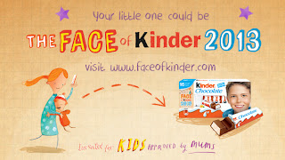
The 'Face of Kinder' campaign.
Recently, Kinder launched the new campaign, 'The new face of Kinder' and I've seen it everywhere. The ads use naive and whimsical pencil-drawn-style illustrations and type. It's a great way to get kids and parents actively involved in the brand.

Having had a couple of holidays in Germany, I know how important their confectionery is to them, how the aisles and aisles of chocolate and gummy bears running down the Galeria Kaufhof food hall (large German department store) are much-loved by residents and visitors too.

For inspiration for children's brands and confectionery brands, I often think to those long aisles of colourful packaging and soft sweet scents, and the light-hearted adverts that make us smile.

Haribo and Maoam

One of the most popular German brands is Haribo. I bet we all know their strapline by now. To get some childlike inspiration and a smile on your face, watch the Haribo and Maoam (sub-brand) ads here:


Maoam ads: www.maoam.de/lang/enGB/index.html

Ferrero and Kinder

And for more inspiration watch the Ferrero and Kinder ads here: www.ferrero.co.uk/?IDpagina=1776

To see the New Face of Kinder campaign, with its lovely typography and illustration style, and to enter your little'un: www.faceofkinder.com

Ferrero is currently running two competitions: to design and win your own bike helmet, and to win a family cycling holiday at Centreparks, with its other sub-brand Nutella. The brand is very much about family involvement, which is smart; it's the parents who buy the product.

Competitions currently run by kinder

Ever noticed that the Nutella and the Kinder logos use a similar style? That's brand continuity, the subtlety that lets you know the two brands are connected.

Connected brands- Kinder and Nutella

Milka

Another great European brand, founded in Switzerland, is Milka (now owned by Kraft, together with Cadbury's and Oreo), who took their purple cow from the packaging and made it into a purple chocolate icon:

Milka Cow massage
Milka Chocolate LogoMilka Purple Cow


Ritter Sport

And for the adults, who love their continental chocolate, take a look at the clean, fresh and colourful Ritter Sport packaging.

Ritter chocolate lorryStack of Ritter Sport Chocolate

Ritter Sport, founded in 1912, was the first chocolate company to use yoghurt in 1970 – an innovative move, and brave for a small family-owned company; the packaging very much reflects the business.

Ritter chocolate packaging 1970s

It's also great of Ritter Sport to put their packaging evolution on the website so we can see how they have evolved over the years:

Evolution of Ritter Sport Chocolate packaging

From my research I gather the museum and factory in Waldenbuch, Germany, or the museum in Berlin, Germany, are very much worth a visit:

Ritter Sport shop in Waldenbuch Germany
Ritter Sport shop at the Waldenbuch factory, credit: www.joetheexplorer.com/
Ritter Sport museum Berlin
Ritter Sport Museum, Berlin

The chocolatiers can create your own bespoke Ritter Sport bar to take home …or consume on the spot.

Are you hungry yet?


Monday, 3 June 2013

Personalisation: putting people in your marketing strategy

Names on new Coca Cola promotional bottles
Just two of the 150 names available on Coke products this summer.
By now we are sure that you have all seen Coca Cola's latest marketing campaign: "Share a Coke with..." It appears that personalisation is a big thing in the food and drink industry at present.

Personalisation can be as simple as using a lead or client's first name on an email, or you could go to the extreme like Coke, and put your customers' names on the products.

Coca Cola have used the top 150 names in the UK to create personalised bottles of regular Coke, Diet Coke and Coke Zero, the idea being that you share the bottles with friends and family.  The campaign is set to be around all summer, and Coke are even hosting events for those whose name do not appear on the shelves, allowing them to have personalised bottles printed.
Irn Bru replace branding with name 'Fanny' on can
The one and only name featuring on an Irn-Bru can

HP Sauce are also jumping on the personalisation bandwagon specifically for Fathers Day (June 16th). Using a Facebook competition, HP are allowing 100 of their biggest fans to win personalised bottles of sauce for their dads. No surprises that your chances of winning are doubled if you choose to share the campaign on your Facebook timeline. HP Sauce state that the reasoning behind the campaign is to reward their most loyal fans (and their dads) in "a new and exciting way".

A slightly tongue-in-cheek nod to personalisation is Irn-Bru's new can. Following on from their TV campaign, the scottish soft drink has released pictures of a personalised can, but it's only suitable if your name is Fanny. Unfortunately the can is not available in stores, and there is no word as yet that it ever will be.
HP personalised bottle for fathers day
An example from the HP Sauce campaign.


Personalisation is a rewarding strategy, both from the prospective of the
business, and your audience. The customer feels that they are being given something back from the company, and the company is able to encourage loyalty and advocacy.

Do you use personalisation in your marketing strategy?


Sources of Information:
http://www.thedrum.com/news/2013/05/31/hp-sauce-offers-facebook-fans-chance-win-personalised-bottles-father-s-day
http://www.thedrum.com/stuff/2013/05/31/irn-bru-jumps-personalised-can-bandwagon-suitable-only-people-called-fanny
http://www.coca-cola.co.uk/faq/products/share-a-coke.html

Friday, 17 May 2013

Is austerity the new luxury?

Packaging from jewellery company Twopenny Lane
An example of the austerity trend from
local jewellery brand, Twopenny Lane.
The financial climate is still tough, and the trends in the economy have been reflected in trends within the packaging industry. Design has been stripped back, muted and simplified, initially to reduce cost in packaging production, but it appears now this has become accepted as 'trendy', but why? Because we think it sits well our price sensitive audience, or conversely, because we think it's the new sign of luxury?


As with everything, there are several sides to this debate. First let's assume that we are designing with the cash strapped economy in mind. Let's suggest that gold still means luxurious and that
Benefit's 1920's style packaging make up range
Benefit's 'Great Gatsby' inspired collection.
flamboyancy is the way to sell luxury products. Look at The Great Gatsby for example. The Guardian hit the nail on the head when they said that Baz Luhrmann's latest offering is "celebrating opulence". The jewellery for the film was designed by Tiffany, the costumes by Prada, everything about the film screams luxury, and some companies are riding on that wave. Take Benefit cosmetics and their 1920's-inspired limited edition packaging. The luxury cosmetics industry never ditched their metallic, intricately designed boxes, velvet covers and superfluous layers of packaging, for butchers twine and a brown paper bag, yet they are still selling products by the bucket load. They know their products have value and people will pay for it. Fact. So with that said, luxury is the new luxury.

Selection of make up from the Body Shop's Leona Lewis collection
The new Leona Lewis collection from The Body Shop.


So now let's look at another side of the argument. This might be a little controversial, but are we the only ones who think that some of the Benefit packaging looks a little cheap? When you compare it to a brand like The Bodyshop, who have stripped their packaging right back to allow the product to take centre stage, Benefit's packaging just looks a bit much. The Bodyshop have not lost their personality by being more reserved with their designs, they have simply aligned themselves with the austerity trend. Although it is not technically a luxury brand, the price point is towards the higher end of high street make-up brands, making this brand a bit of a luxury when financial times are hard.


Looking at some of the greats in graphic design, such as Herb Lubalin, it's easy to see why design austerity can be such a successful strategy for a brand.  He has been described as proving that "to be effective, all you need is a typeface and a good idea" (Adrian Shaughnessy), removing the need for all the excessive elements of design. Furthermore, it has been argued that because of a change in attitudes towards 'organic' and 'pure' products, (both of which are becoming increasingly important in the cosmetics industry), consumers now associate luxury products with packaging featuring quirky graphics, hand-written styles of text, less focus on colour, and more on texture. In times of austerity, brand loyalty is easily swayed. Packaging plays such a huge role in consumer decision making, and getting that right for your potential, (and existing), customers is paramount.

An example of Herb Lubalin's work with typefaces
The power of the typeface. The development of the food wall, designed by Herb Lubalin and Tom Carnase for Lou Dorfsman, director of design at CBS in 1966.
Finally there's the argument that people will buy what people will buy, regardless of the economic situation, or trends in packaging. Suppose that with or without the pomp and ceremony of the golden YSL box that people would still buy the product because they "simply can't live without it", ask the majority of women who own Touche Éclat how many they have bought, and whether they pay that much attention to the packaging!

However we believe that, when a consumer is in the market for a new product, your packaging plays too much of a part in purchasing decisions to be ignored. Once that purchase becomes habit, packaging plays a lesser role. But surely you always want to be attracting new customers, so packaging always matters.

We'd love to hear your thoughts on this, how do you think the economy has affected luxury packaging, if at all? Are you more attracted to the 'shiny' or the quirky?

Sources of information:
http://www.packagingnews.co.uk/design/markets/a-quest-for-luxury-in-austere-times-markets-luxury-packaging/ 

http://www.printmag.com/interviews/designer-for-the-age-of-austerity-adrian-shaughnessy-on-herb-lubalins-life-and-work/  
http://www.jkrglobal.com/design-gazette/flapper-fabulous/#comments

Tuesday, 26 February 2013

Gone are the days of the humble box

Here at United by Design we love quirky packaging. A link on Facebook captured our attention and got us looking at some innovative packaging ideas. After a little more digging around on the internet we came up with this slideshow of packaging ideas that got us talking, laughing, and thinking, exactly what good packaging should do:


Created with Admarket's flickrSLiDR.

We think these are great, which one is your favourite?

It is quite clear to us that in a world where innovation is king and standing out from the crowd is key to success, it is no longer enough to just have a good product. Sure, without a good product you have nothing, but without the tools to sell it, then you just have a lot of product, and not a lot of pennies! Your brand packaging is what makes your product great; it’s what sells it. Packaging should say, “Hey, you, look at me! Pick me up! I am better than that product there, look at my exciting packaging!” Ok, so packaging doesn’t really talk, but a picture is worth 1,000 words, and your packaging needs to tell your consumer everything your product has to offer. It needs to ooze personality and help tell the brand story.

So you’re happy with your product, you think it’s the bee’s knees, but the masses don’t seem to agree with you, what do you do? You need to get some insight from market research, from the people who buy your product but also those who don't, to find out why they don't! Then you need to look at category cues, your competition, those who do amazingly well – so you can benchmark and of course look at your brand story and see how you can express it to entice and draw people in.

Never be afraid to change things! This may be through evolution or perhaps you need to employ and more aggressive approach and innovate in your sector. Do not be afraid to do thing differently to help differentiate! It will ultimately help you to develop your business. Gain insight and act on it!

Take SLOEmotion for example. We continue to enjoy work with the team to evolve their company and the way they do things – ‘evolution rather than revolution’. The basics were already there, a great, award winning product and a signature bottle shape. United by Design has brought the SLOEmotion range of products together, whilst differentiating between the various spirits (gin, vodka, brandy, whiskey), using category cues to help instant recognition; the characteristics that people associate with certain products, e.g red is associated with vodka and purple with sloe gin. The distinctive shape of the SLOEmotion 35cl bottles enabled us to extend the brand to a large 70cl size and a gift range of 5cl bottle, all accentuate the originality of the SLOEmotion brand story. Focussing on finer details such as the hedgerow sprig, strap-line, and focus on the actual fruit help the consumer to be clear on what they are buying.

We also helped to reduce packaging costs for the truffle ranges by designing a generic signature box with a range of product stickers depending on the contents of the box. It’s these simple yet effective ideas that make all the difference in such a competitive market for a business that is thinking about the bottom line as well as making profits!

Sloe Motion Gin before and after

Early last year we worked closely with the company to launch a new product that’s packaging design has a completely different feel to the others that have been developed to date. SLOEmotion No. 7 fruit cup (gin based mixer) has a fun and fresh design but is still easily identifiable as a SLOEmotion product. Compared to its competitors it has a contemporary design that makes it stand out on the shelves. SLOEmotion have embraced change and challenged the norm to help them define themselves in a very competitive market where other companies have lead for a long time and other brands have decided to create 'me too' products that look lifeless and very much a lesser product due to the strength of the brand leader. This approach, although calculated, is enabling SLOEmotion to make a name for themselves as being different – in a good way!

Sloe Motion No.7 collage

What we’re really getting at is that packaging no longer just serves as a means of housing a product, it’s a strategic design process, and to get ahead you really have to ‘think outside the box’ (see what we did there?).


Images from: 
http://humorcamp.com/view/6251/
www.thedieline.com

Wednesday, 16 January 2013

Selfridge’s ‘No Noise’ Campaign- Proving the power of branding?

Selfridges no noise campaign screen shot
A screen shot of the 'no noise' website.
Have you been watching ‘Mr. Selfridge’ on ITV1? It’s been fascinating to learn about the rise of the department store, and about the characters that you could have found there. Harry Gordon Selfridge was a pioneer of his time, bringing the UK a retail experience they had never had before. It even included a bargain basement.

Selfridge strip it back to basics

Fast-forward to now, 113 years later, and Selfridges is still aiming to inspire and capture attention, the same way that Mr. Selfridge himself did when he installed the first aeroplane to cross water in the department store in 1909. That stunt attracted over 150,000 visitors! 

When Selfridges originally opened, Mr. Selfridge included a silence room for shoppers to escape from the hustle and bustle of the store. This year this room has been reinstated as part of Selfridges ‘No Noise’ campaign. Selfridges believe that we are becoming more and more bombarded with information such as advertising and branding, and have therefore collaborated with some of the world’s most recognisable brands. They have asked these brands to remove their logos from some of their best-known products in order to create a ‘Quiet Shop’, a shop free from branding.

Successful silence? Or screaming louder?

Heinz beans no logo
Still looks branded to us!
Although this is a great idea, and it is indeed true that we are now constantly attacked by information left, right and centre, we can’t help but question the success of this campaign. Sure, it’s lovely to have somewhere to relax on a busy shopping day, and escape from the crowds, but is buying a tin of beans that doesn’t say Heinz, yet still has their signature image on, sticking fingers up at branding? We think not.


It’s branding and novelty that make this campaign interesting. You wouldn’t go out of your way to buy an unbranded tin of Value beans, so why would you pay £1.99 for a Heinz tin? Brand recognition, that’s why. You look at the Heinz tin and think, “oh that’s quirky, it might even be collectable one day”, and that’s because it’s a recognised brand! It doesn’t have to say Heinz for you to know what it is; the Levi’s 501s they are selling don’t have to say they are Levi’s, because you already know.

Tin can with no branding
Can you tell if this one is Heinz?
Good branding brings power. All the brands involved in this campaign can still be recognised without their logos, it wouldn’t work if it were any other way. So to say these products are ‘de-branded’ is not strictly true. It’s not just the logo that makes your brand, it’s the colours, the shape of the packaging, the graphics; it’s everything. And that’s what all these brands have in common, you recognise everything about them. Strip it back to a plain old can and then tell us if you can spot the difference! You couldn’t, and that’s why they won’t. 


Don’t get us wrong, we think this campaign is fun, different, and has certainly served it’s purpose, it captured UBD’s attention and got us talking about it. But rather than making things ‘quieter’, it’s really only proved that the information we are bombarded with really does stick, and taking the logo’s off a few products isn’t going to undo that. It’s just going to make people work harder to challenge, and be as successful as, the ‘big guns’, so one day they can take their logo off their product and the masses will recognise it too. And that keeps us in work!
What do you think, serious campaign or a fun and quirky way to get people talking even more about branding?


Information and images from:
http://www.selfridges.com/en/StaticPage/Our+Heritage/
http://www.georgianhousehotel.co.uk/london-shopping/selfridges.asp
http://nonoise.selfridges.com/
http://www.sxc.hu/